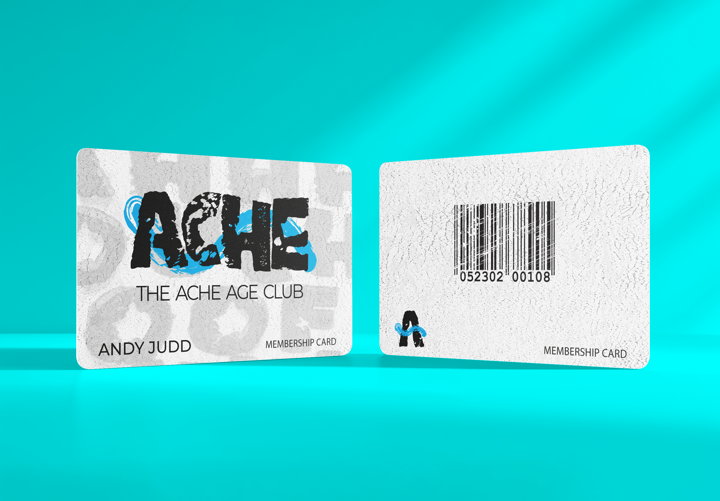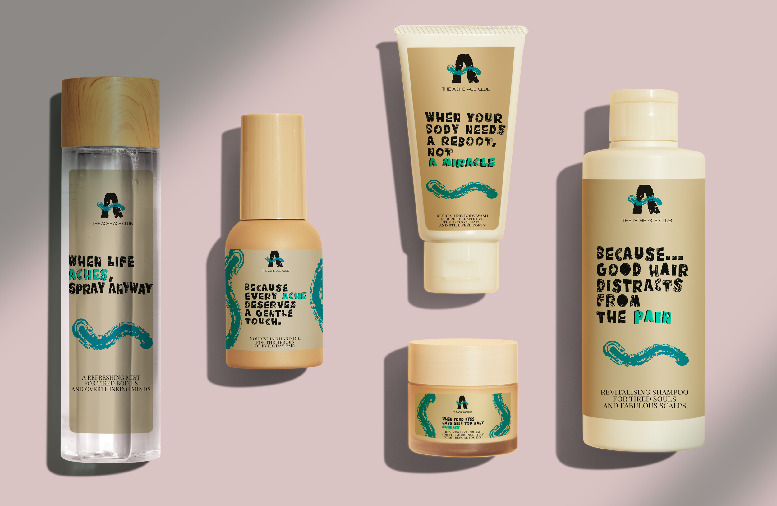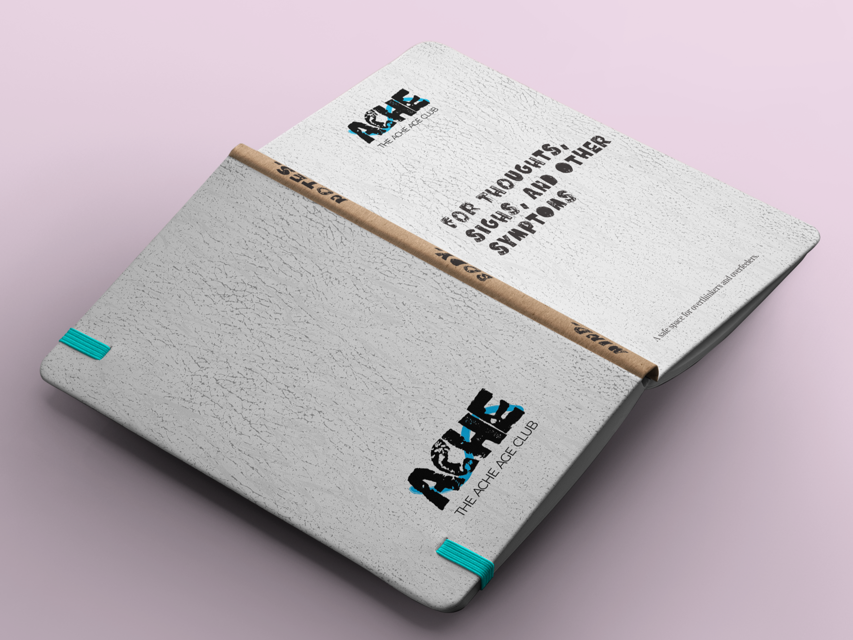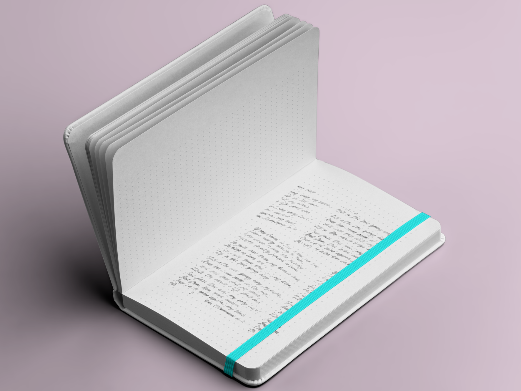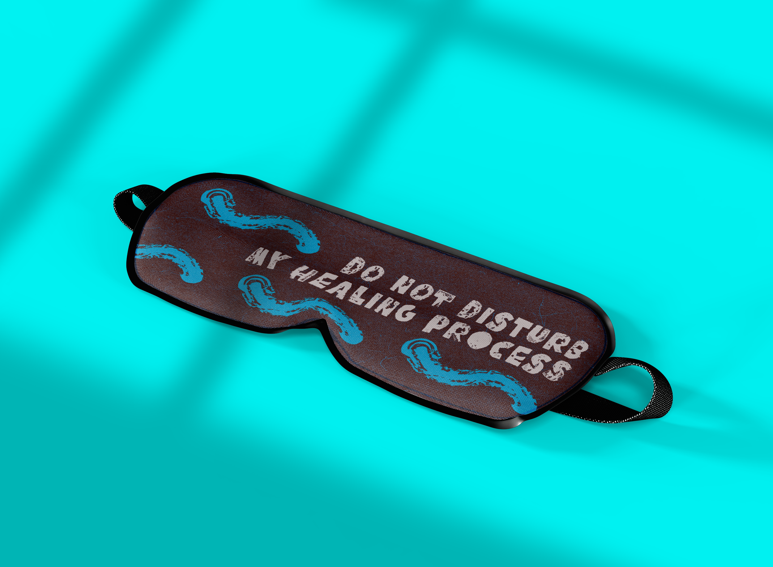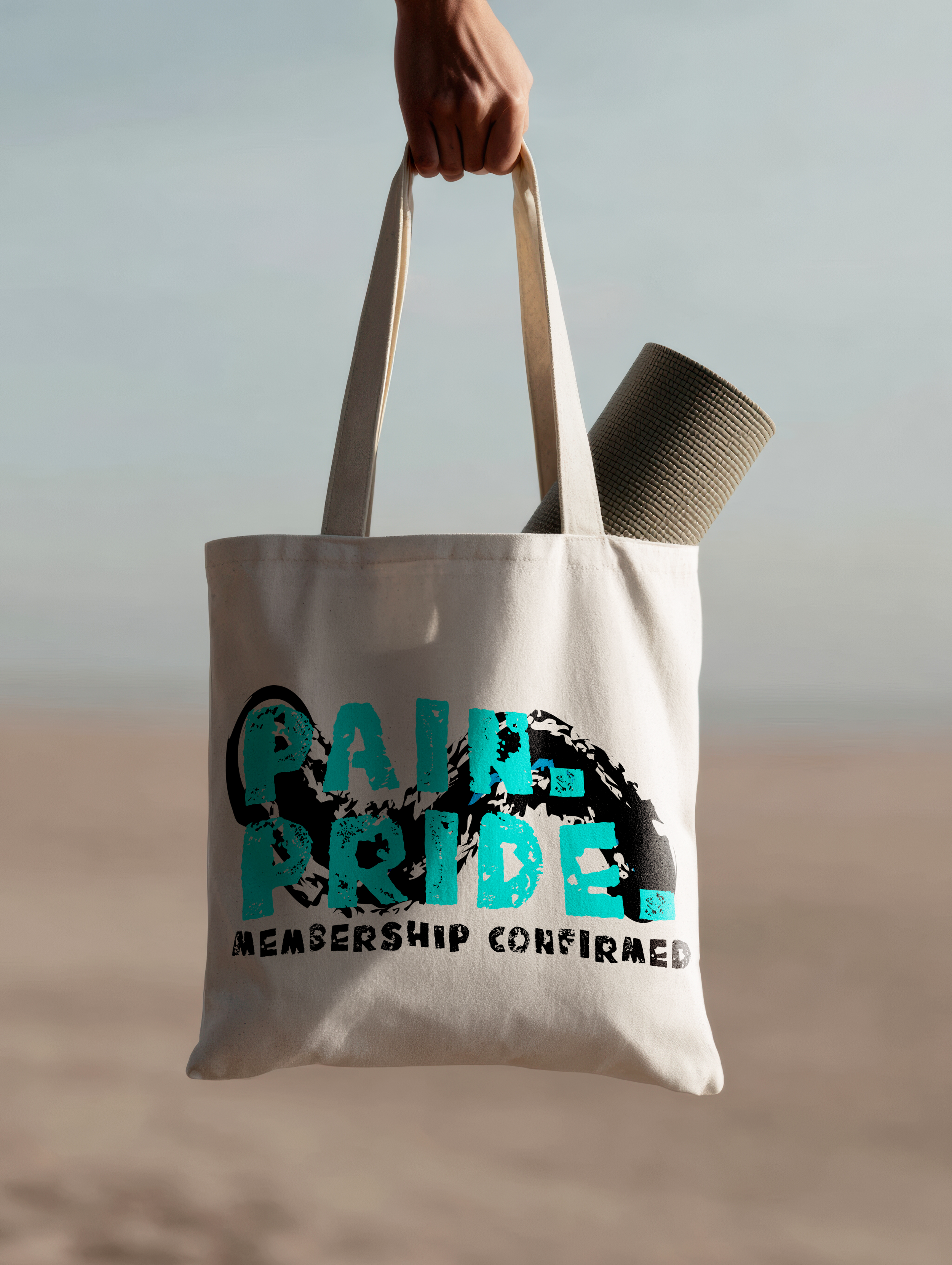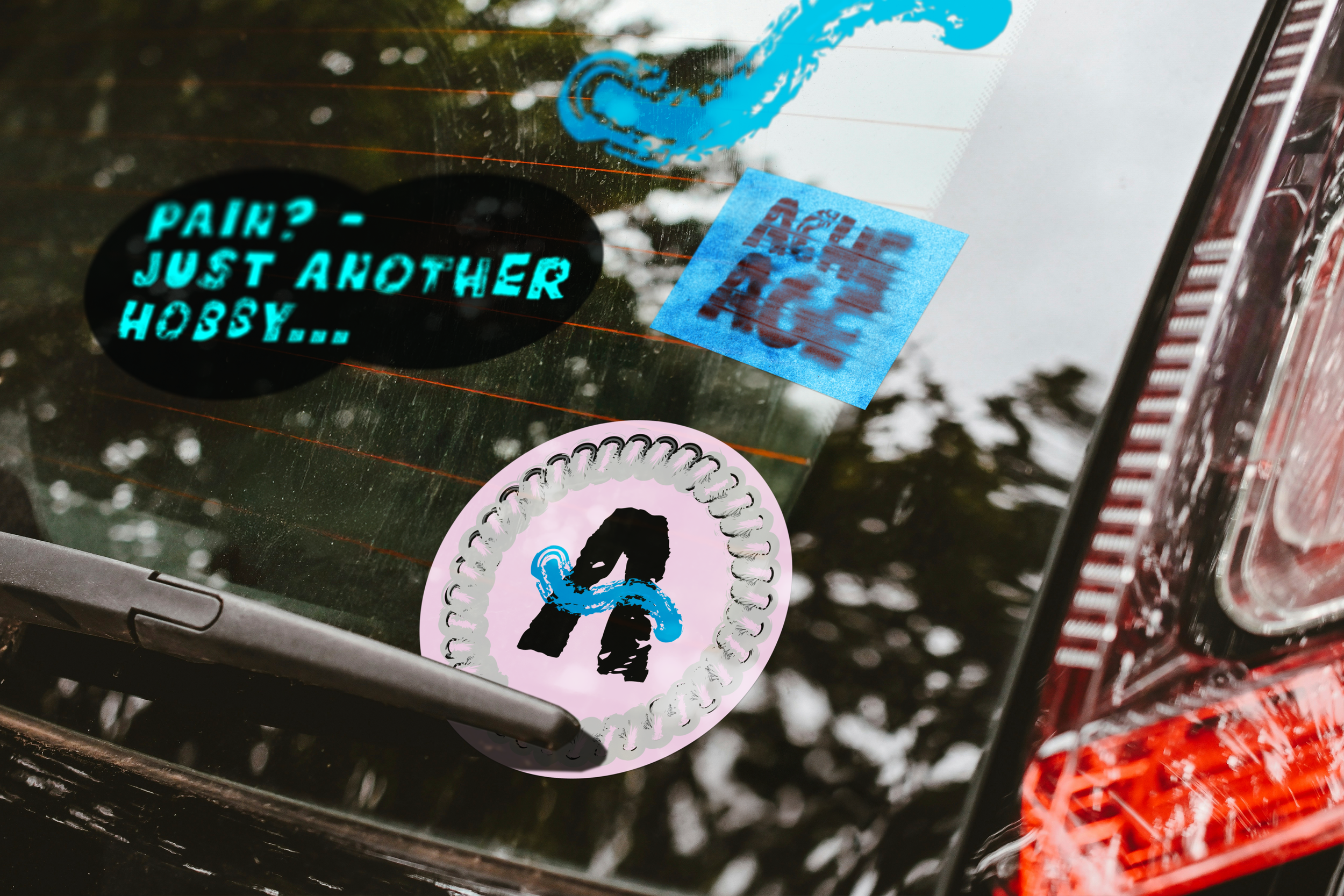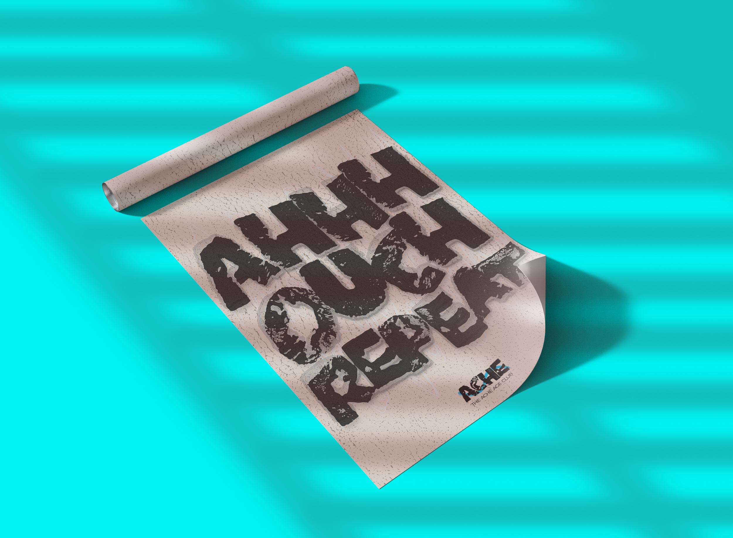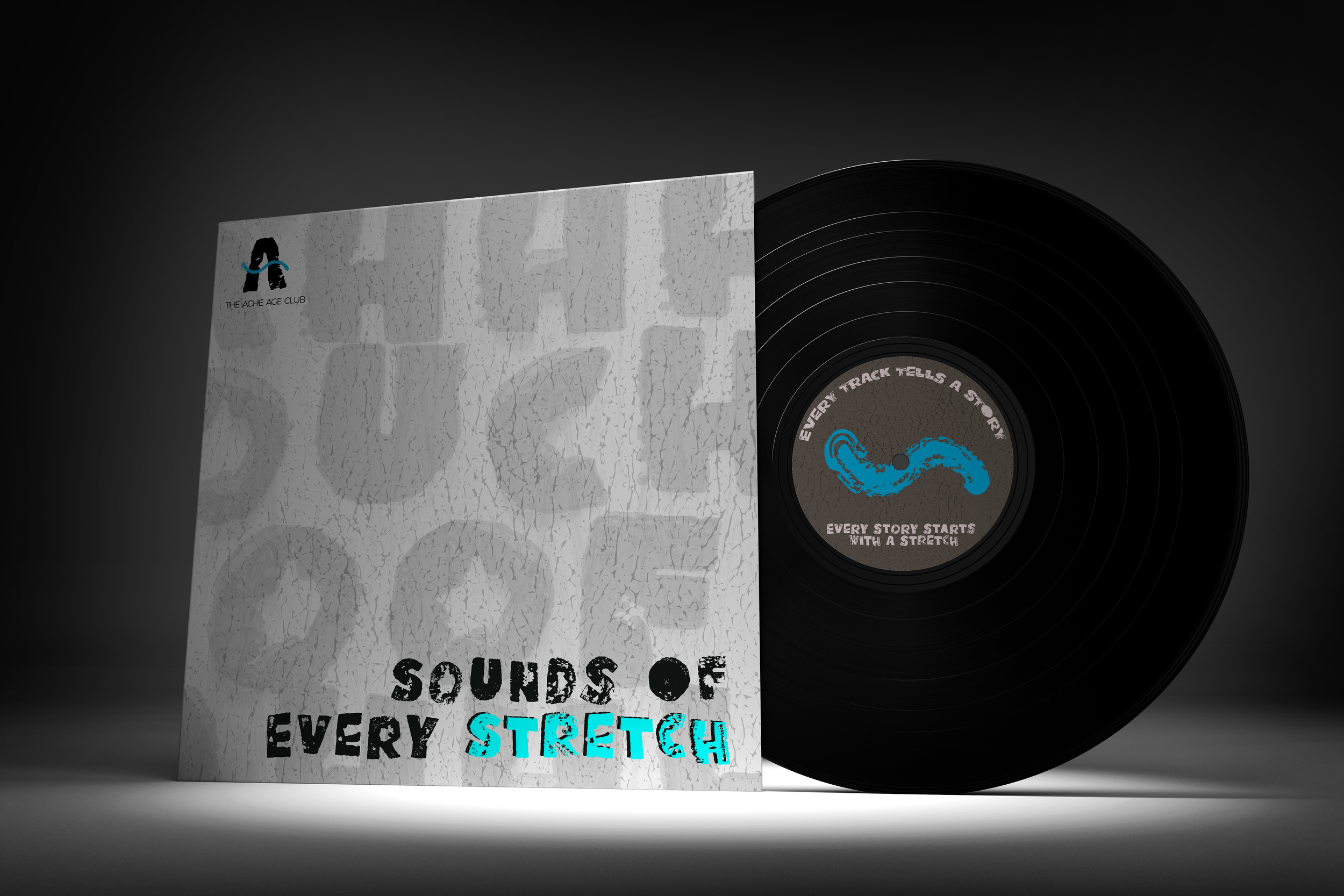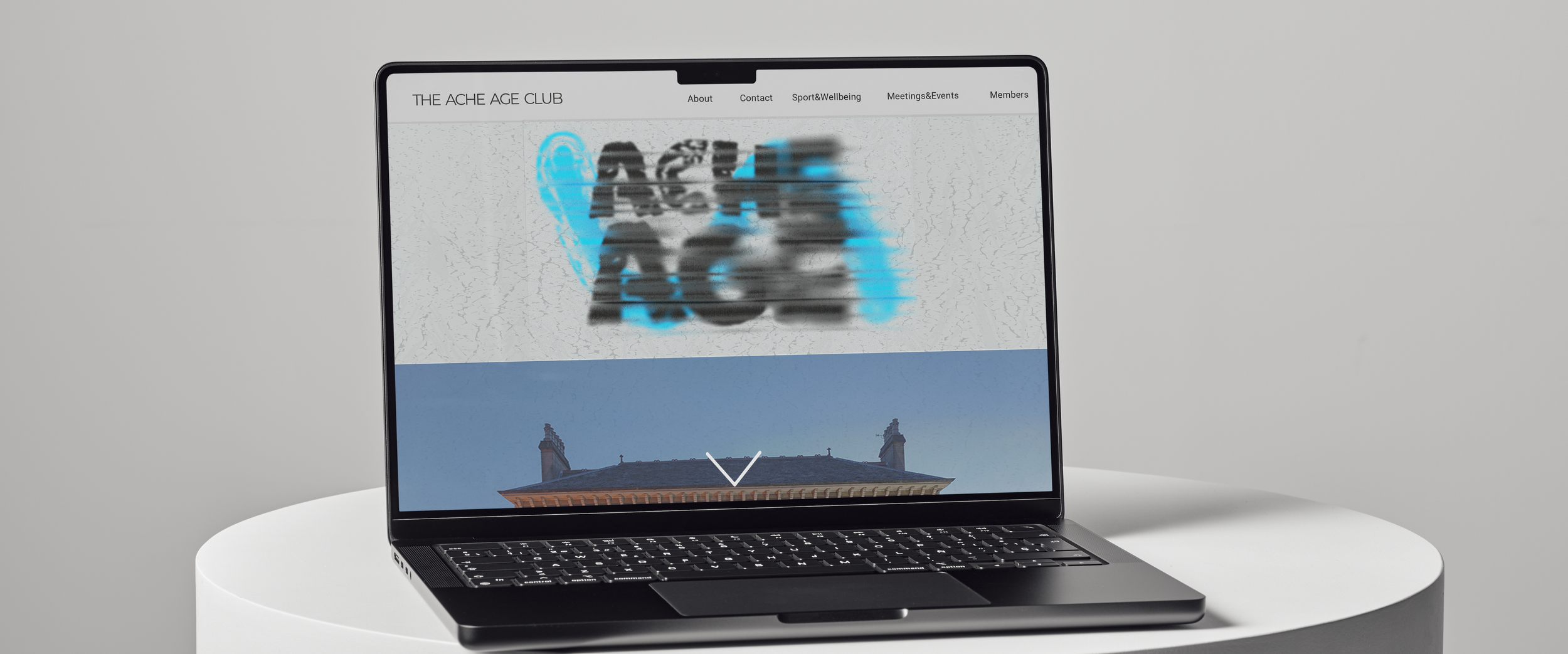
The Ache Age Club is a concept-driven branding project inspired by the atmosphere of Western Baths Glasgow and the shared experience of midlife aches, movement, and humour. The project reimagines wellness culture for people aged 40–50 by transforming everyday discomfort into a source of connection, irony, and community.
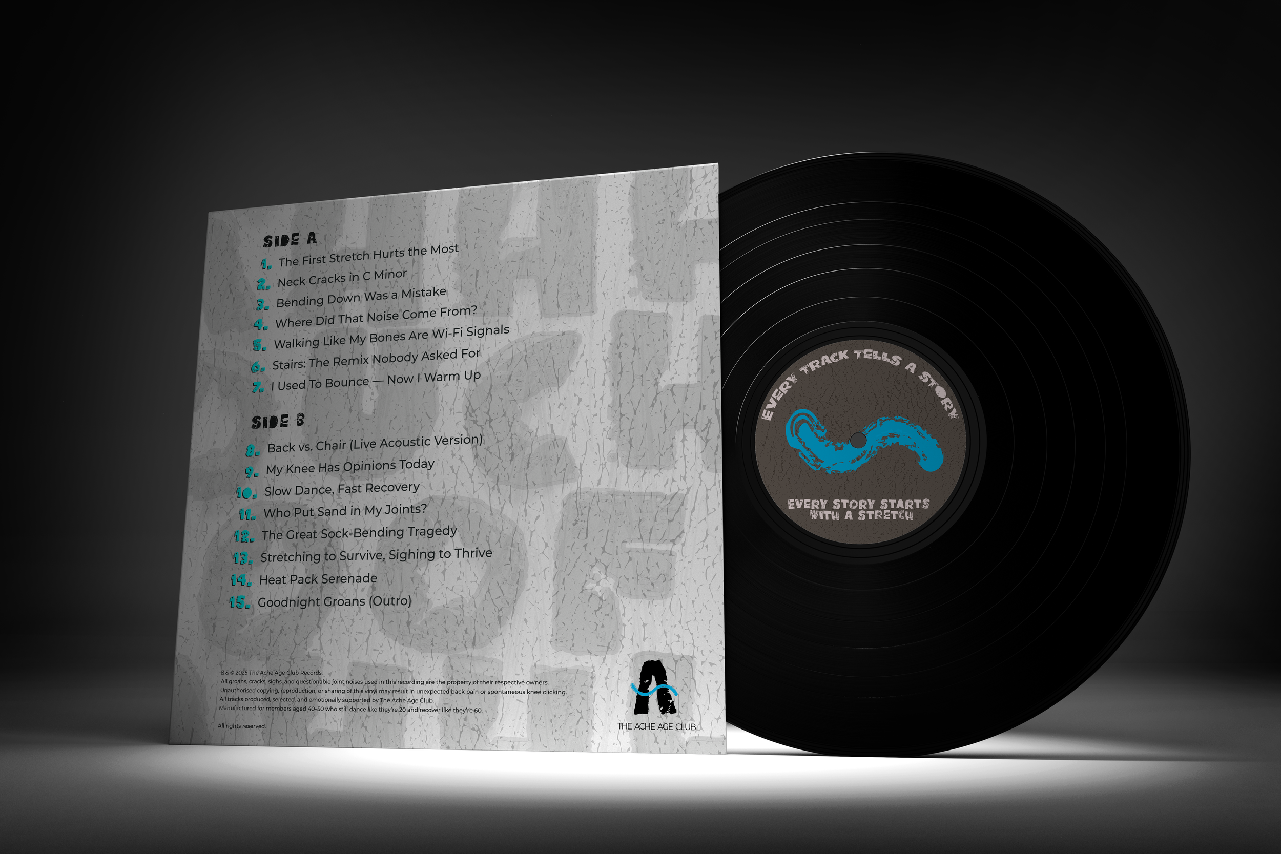
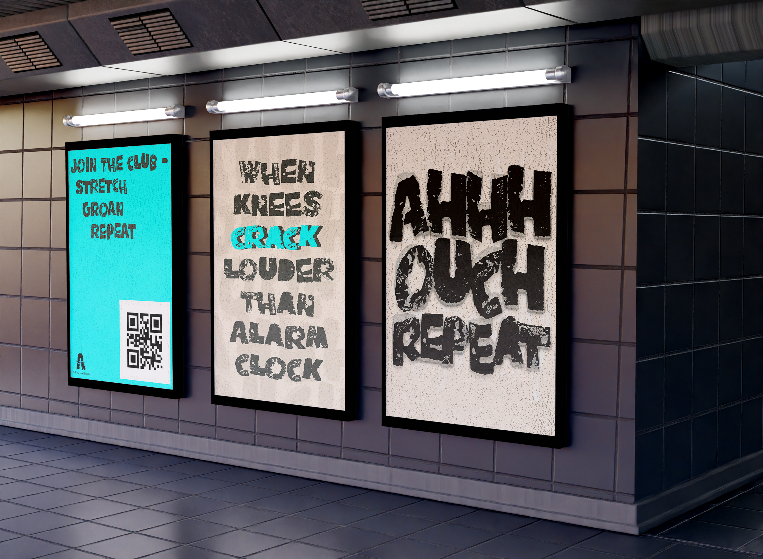
The visual identity combines expressive typography, textured graphics, and a playful tone of voice to create a brand that feels both honest and approachable. A contrasting colour palette of warm neutrals and neon blue references physicality, recovery, and contemporary digital culture, balancing humour with self-care.
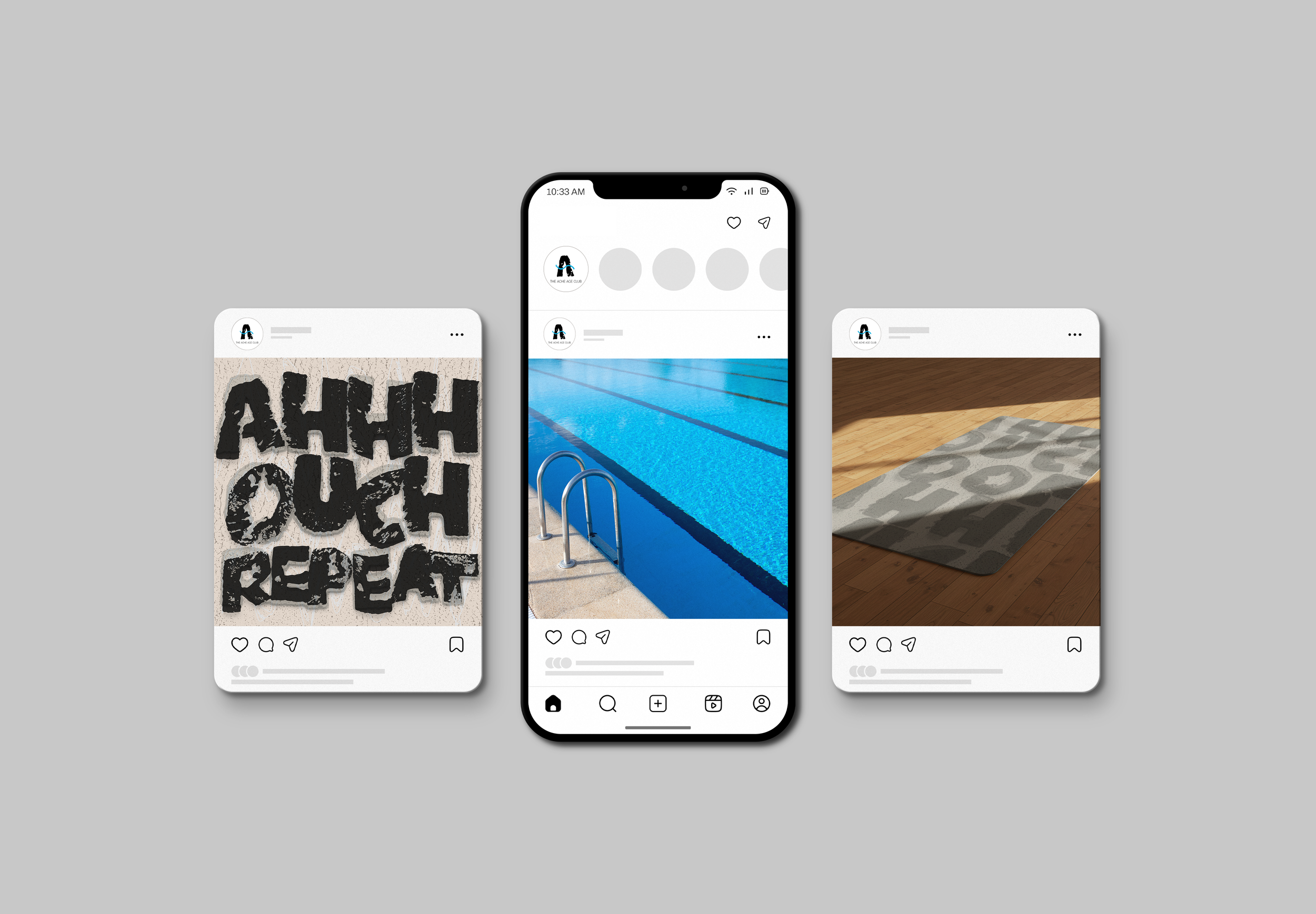
The project extends across a full brand system including membership packs, wellness products, printed materials, posters, merchandise, and promotional assets. Through concept-led design and storytelling, the brand creates a playful visual language that celebrates ageing with humour rather than embarrassment.